
The ROC – AUC curves for Classification based Model Performance Analysis
Accuracy is something which gives an intuition of model performance. i.e. ratio of number of correct predictions with respect to total sample present. But what in case of unbalanced data.
Imagine a case where we need to make a model to predict click through rate over a display rate. The click trough rate used to be very less around 1 in a 1000 or 1 in a 10000. Now the data we can use is having false dominance which may lead to bias situation. It can take us to a accuracy level of 99.99% of a model but that is having no meaning. So for class imbalanced data we try to separate different kinds of errors.
If you are dealing with classification problem then predicting probability of each class can be more flexible approach then directly predicting the class.
We are having two diagnostic tools that can interpret problistic forecast for binary (two-class) classification – ROC curves and Precision-recall curves.
Suppose you are working on two class binary classification problem so you need to decide a threshold value which can interpret your result as 1 or 0. For example if threshold is 0.5 then probability in [0.0, 0.49] is a negative outcome (0) and a probability in [0.5, 1.0] is a positive outcome (1).
This threshold can be adjusted to tune behaviour of a model for a specific problem. When making a prediction for a binary two-class classification you will have two types of error.
• False Positive. Predict an event when there was no event.
• False Negative. Predict no event when in fact there was an event.
By tuning the threshold, a balance between these two concerns can be chosen by operator of the model.
A common approach to compare models that predict probabilities of two class problem is ROC curve.
ROC Curve [Receiver Operating Characteristics Curve]- It is a graph which represents the performance of a Classification based model at different threshold value. The coordinates of the graph is represented by two units which are: –
True Positive rate or TPR (Recall) is defines as : –
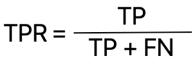
Where TP stands for True Positive and FN stands for False Negative
And False Positive Rate or FPR defines as: –
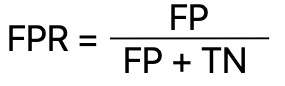
Where FP stands for FalsePositive and TN stands for True Negative
In General TP,FP,TN,FN are define as follow: –
We can summarise or model performance into 2*2 Confusion matrix
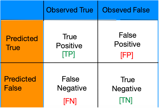
True Positives: – A model correctly predicts a positive class. For example: – Correct test report for a Covid infect person. Treatment started early and get cured.
False Positives: – Error – report of Non-Infected person is positive.
False Negatives: – Error – Report of Infected person is negative and he couldn’t survived
True Negatives: – A model correctly predicts a negative class. Foe example: – Test report of non-infected person is negative and he is happy.
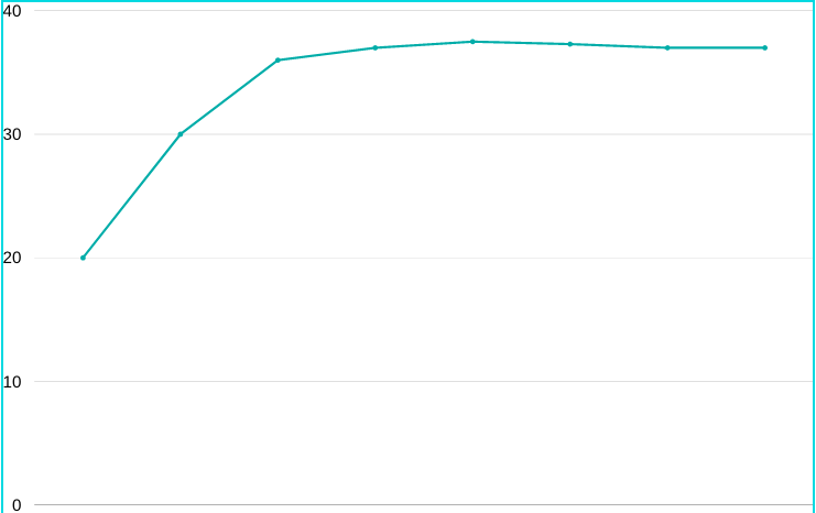
ROC curve –
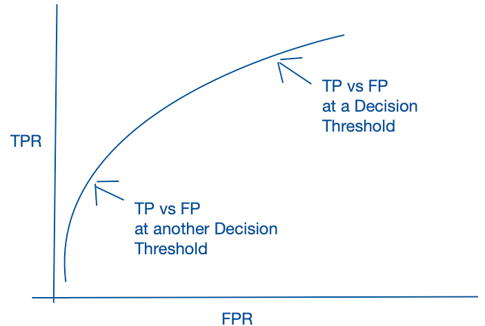
So it is a process where we evaluate all possible classification threshold and look for true positive rates and false positive rates at the given threshold. Now when we connect those dots then the area under curve gives a probabilistic interpretation.
The ROC curve is a useful tool for a few reasons:
• The curves of different models can be compared directly in general or for different thresholds.
• The area under the curve (AUC) can be used as a summary of the model skill.
The shape of a ROC curve contains a lot of information such as: –
• Smaller values on the x-axis of the plot indicate lower false positives and higher true negatives.
• Larger values on the y-axis of the plot indicate higher true positives and lower false negatives.
There is always a tension between correct prediction (True Positive) and Incorrect prediction (False Positive) and so as for True negative and False negative in case of binary class classification.
⁃ A better model will be with higher probability of a randomly chosen real positive occurrence than a negative occurrence on an average.
⁃ Generally a good model is represented by curves that bow up to the top left of the plot.
⁃ A no-skill model will be represented at the point (0.5,0.5). A no-skill model at each threshold is represented by a diagonal line from bottom left of the plot to top right.
⁃ A best possible model is represented at a point (0,1). It will be represented by a line that travels from bottom left of the plot to the top left and the across the top to top-right.
ROC-AUC using Python
# roc curve for logistic regression model with optimal threshold
import numpy as np
from sklearn.datasets import make_classification
from sklearn.linear_model import LogisticRegression
from sklearn.model_selection import train_test_split
from sklearn.metrics import roc_curve
from matplotlib import pyplot
Define a data set with two classes represented by 0 and 1.
# generate 2 class dataset
X, y = make_classification(n_samples=500, n_classes=2, random_state=1)
# split into train/test sets
trainX, testX, trainy, testy = train_test_split(X, y, test_size=0.5, random_state=2)
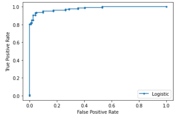
Train Your model using logistic regression. And make the probality prediction for each sample. When probability for both class is calculated you can consider probable value for any one of them for ROC-AUC curve by evaluating multiple threshold.
# fit a model
model = LogisticRegression()
model.fit(trainX, trainy)
# predict probabilities
yhat = model.predict_proba(testX)

print(yhat[0:5])

# keep probabilities for the positive outcome only
yhat = yhat[:, 1]
print(yhat)
#Output
[[7.51796426e-04 9.99248204e-01] [9.99557563e-01 4.42436762e-04] [9.97572307e-01 2.42769279e-03] [4.17406756e-01 5.82593244e-01] [9.60526311e-01 3.94736887e-02]]

[9.99248204e-01 4.42436762e-04 2.42769279e-03 5.82593244e-01 3.94736887e-02]
Plot the ROC curve after calculating AUC value.
# calculate score
auc = roc_auc_score(testy, yhat)

# summarize score
print('Logistic: ROC AUC=%.3f' % (auc))

# calculate roc curves
fpr, tpr, thresh = roc_curve(testy, yhat)

# plot the roc curve for the model
pyplot.plot(fpr, tpr, marker='.', label='Logistic')

# axis labels
pyplot.xlabel('False Positive Rate')
pyplot.ylabel('True Positive Rate')
# show the legend
pyplot.legend()
# show the plot
pyplot.show()
#Output Logistic: ROC AUC=0.979
You will get multiple threshold value based upon which ROC curve has been created. Print all the threshold values.
print(thresh)
[1.99999973e+00 9.99999734e-01 9.14643015e-01 9.08676511e-01 8.94842510e-01 8.91325956e-01 8.66121867e-01 8.65983687e-01 7.65938474e-01 5.82593244e-01 5.42403454e-01 5.39761514e-01 5.06345377e-01 3.44490602e-01 3.25430755e-01 2.12080871e-01 1.98292799e-01 1.01171661e-01 8.79511676e-02 8.34821481e-02 7.87894569e-02 5.64455891e-02 5.60292941e-02 3.37165762e-02 3.35979929e-02 1.33538797e-02 1.32146021e-02 2.56713887e-06]
How can we locate threshold for binary classification with optimal balance?
Step 1: – We will Calculate Sensitivity which is true positive rate
Sensitivity = True Positive/ (True Positive + False Negative)
Step 2: – Calculate Specificity, which is inverse of False Positive rate
Specificity = 1 – False Positive Rate
Step 3: – Calculate G-mean or Geometric-Mean which is metric for imbalanced classification that if optimised , will seek a balance between sensitivity and specificity.
G-Mean = TPR * (1-FPR), It will be maximum when at a particular threshold True Positive Rate and inverse of False Positive Rate is maximum.
Step 4: – Figure out the threshold with Maximum G-Mean.
# calculate roc curves
fpr, tpr, thresholds = roc_curve(testy, yhat)

# calculate the g-mean for each threshold
gmeans = tpr * (1-fpr)

# locate the index of the largest g-mean
ix = np.argmax(gmeans)
print('Best Threshold=%f, G-Mean=%.3f' % (thresholds[ix], gmeans[ix]))

# plot the roc curve for the model
pyplot.plot([0,1], [0,1], linestyle='--', label='No Skill')
pyplot.plot(fpr, tpr, marker='.', label='Logistic')
pyplot.scatter(fpr[ix], tpr[ix], marker='o', color='black', label='Best')

# axis labels
pyplot.xlabel('False Positive Rate')
pyplot.ylabel('True Positive Rate')
pyplot.legend()

# show the plot
pyplot.show()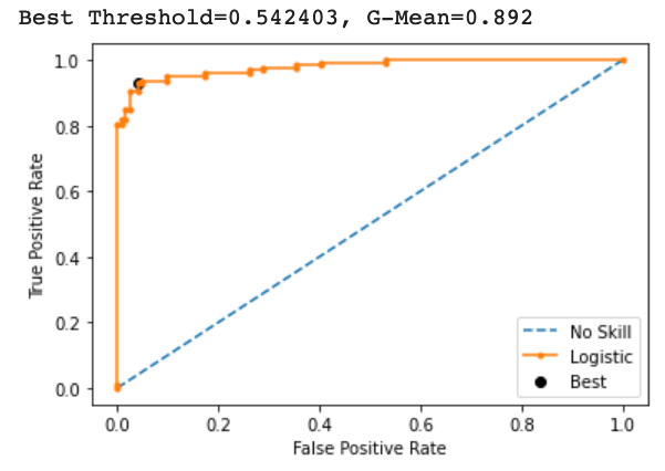
It shows at Threshold = 0.542403, G-mean is maximum which means the best suited threshold value for this binary prediction is 0.54.
Summary
In this reading you learn about theoretical concept behind ROC curve and How maximum AUC represents the maximum accuracy for a model. Along with it you went through certain model performance analysis concepts – True Positive Rate and False Positive Rate.
In the next reading you will understand Precision recall curve. Good Luck. Keep Exploring.